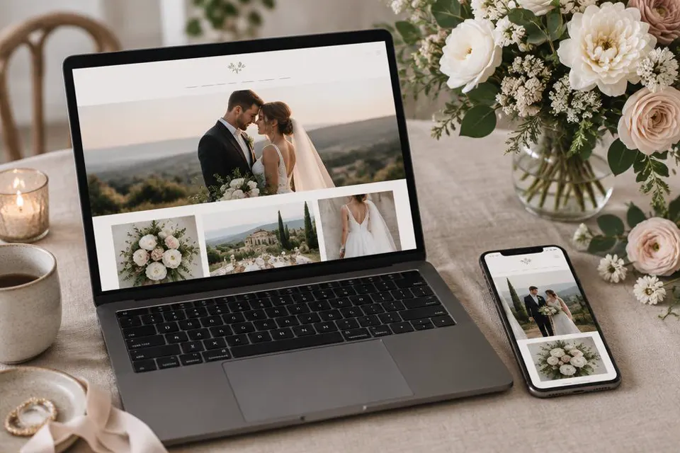
Why Studying Wedding Website Examples Helps
Before you open a template and start typing, it helps to understand what separates a wedding website that guests actually use from one that sits unopened in an inbox.
Most couples have never built a website before, so it is natural to feel unsure about what sections to include, how much personality to show, and how formal or casual the wording should be. Looking at a range of wedding website examples gives you a mental library of choices, so instead of staring at a blank page you are reacting to options you have already seen and deciding which ones fit your own wedding.
A good example also teaches you about pacing. The best wedding websites do not try to say everything on the home page. They greet the guest, give the date and location at a glance, and then let people click through to the details they actually need, such as the schedule, the registry or the RSVP form. When you study several examples side by side you start to notice this rhythm and can apply it to your own site even if your wedding looks nothing like the ones you studied.
Finally, examples help you avoid common mistakes before you make them. Many first drafts of a wedding website bury the RSVP link, forget to mention the dress code, or assume guests already know travel logistics that are obvious to the couple but not to anyone flying in from another city. Reviewing other people's finished sites, even ones you do not love stylistically, often reveals a detail you had forgotten to plan for.
Example One: The Classic and Elegant Site
This style suits couples having a formal wedding, often with a black tie or cocktail dress code and a seated dinner reception.
Picture a home page with a soft, neutral background, the couple's names in a serif font, and a single line underneath that reads something like, We are getting married, and we would love for you to join us. Below that sits the date, written out in full rather than numerals, for example the fourteenth of March, two thousand twenty six, which immediately sets a formal but warm tone.
The navigation on this kind of site is usually simple: Our Story, Schedule, Travel, Registry and RSVP. Each page keeps paragraphs short and avoids slang. The schedule page might read, Ceremony begins at four in the afternoon, followed by a cocktail hour on the terrace and dinner at seven. Guests are told exactly when to arrive and roughly how the evening will flow, which matters a great deal for a formal event where people plan their outfits and travel around precise timing.
What makes this example work is restraint. There is no clutter, no flashing graphics, and no overly casual language. The couple trusts that the content itself, clearly organised, is enough to make guests feel excited and informed. If you are planning a formal wedding, this is a useful style to study because it shows how elegance comes from clarity rather than decoration.
Sample wording from a classic site
Our Story: We met on a rainy Tuesday in university and have been inseparable since. Nine years, two cities and one very patient dog later, we are thrilled to begin this next chapter as a married couple, surrounded by the people who have shaped our lives.
Dress Code: We kindly request formal attire. Think dark suits and cocktail or evening dresses. The ceremony and reception are both indoors, so comfortable formal shoes are welcome.
Example Two: The Fun and Casual Backyard Wedding Site
At the other end of the spectrum is the laid back, personality forward wedding website, often used for backyard, farm or small destination weddings.
This kind of site tends to open with a photo heavy banner, playful fonts, and a greeting that sounds like the couple is talking directly to a friend. A typical opening line might read, We are tying the knot and throwing the best backyard party you have ever seen, and you are invited. The tone is warm, funny and personal rather than formal.
The schedule section often includes small, specific touches that a classic site would leave out, such as, Bring a jacket, it gets chilly once the sun goes down, or, There will be a fire pit later for anyone who wants to stick around. These details show that the couple has thought through the evening from the guest's point of view, not just the ceremony itself.
A casual wedding website also tends to lean into storytelling. Instead of a short formal biography, couples write longer, funnier anecdotes about how they met, inside jokes, or a timeline of silly milestones like the first time they cooked dinner together and nearly set off the smoke alarm. This builds anticipation and gives out of town guests, who may not know the couple well, a sense of who they are before they even arrive.
Example Three: The Destination Wedding Site
Destination weddings put extra pressure on the website because guests are being asked to commit time and travel, so the site has to answer a lot of logistical questions clearly.
A strong destination wedding website usually opens with the location front and centre, often with a short line explaining why the couple chose it, such as, We fell in love with this coastline on our first trip together, and we cannot imagine celebrating anywhere else. This context helps guests feel like the location is meaningful rather than an inconvenience.
The travel section on these sites tends to be the longest and most detailed page on the whole website. It usually includes the nearest airports, a rough idea of transfer times, suggested arrival and departure days, and information about the local climate so guests know what to pack. Some couples add a simple map embed showing the venue in relation to nearby accommodation.
Good destination wedding sites also address cost and time commitment honestly without ever stating actual figures. They might write, We know this trip is a big ask, and we are so grateful to anyone who can join us. We have tried to keep costs manageable by recommending a range of accommodation options nearby. This kind of honest, appreciative tone goes a long way in a destination context.
What a destination wedding page should always include
- Nearest airport and realistic transfer time to the venue
- Suggested dates for arrival and departure
- A short list of accommodation options at different comfort levels
- Local weather and packing suggestions for the season
- Any visa or document reminders relevant to the location
- A note about optional group activities before or after the wedding
Example Four: The Multilingual or Multicultural Site
Weddings that bring together two cultures or two languages need a website that treats both traditions with equal care.
A thoughtful multicultural wedding website often includes a toggle or side by side layout so that content appears in both languages, rather than relegating the second language to a small afterthought at the bottom of the page. Even a simple line at the top, available in English and Hindi, or available in English and Mandarin, signals to guests from both sides that they are equally welcome and equally informed.
These sites also tend to spend time explaining ceremony traditions that some guests may not be familiar with. For example, a couple might write a short, friendly paragraph describing what happens during a tea ceremony, or explaining that the wedding will include two separate events on two different days, each with its own dress code and timing. This kind of explanation is not about teaching a culture lesson, it is simply about helping every guest feel prepared and comfortable.
Dress code guidance becomes especially important here, since colours, fabrics and formality can mean very different things across cultures. A good example site is specific: Guests are welcome to wear traditional dress from any culture. For the ceremony, we ask that white be reserved for the bride. For the reception, anything festive and comfortable for dancing is perfect.
Example Five: The Minimalist One Page Site
Not every wedding needs ten pages of content. Some of the most effective wedding websites fit everything onto a single, well organised scrolling page.
This style works particularly well for smaller, more intimate weddings where the guest list is close friends and family who already know the couple's story. Instead of a full Our Story page, the site might include just a photo and two sentences. The emphasis shifts almost entirely to logistics: date, time, location, RSVP and a short FAQ.
The strength of a minimalist site is speed. A guest can open it on their phone, scroll for thirty seconds, and walk away knowing everything they need. There is no hunting through a navigation menu or clicking between five different pages to find the ceremony start time. For guests who are busy or less comfortable with technology, this simplicity is genuinely appreciated.
If you choose this style, resist the urge to leave out important details just because the page is short. A minimalist site should be concise, not incomplete. Every essential fact, from the RSVP deadline to the dress code, still needs a clear home on the page, just without extra decoration around it.
| Style | Best for | Typical length | Tone |
|---|---|---|---|
| Classic and elegant | Formal, seated dinner weddings | Four to six pages | Polished, warm |
| Fun and casual | Backyard or relaxed celebrations | Three to five pages | Playful, personal |
| Destination | Weddings requiring travel | Five to seven pages | Informative, grateful |
| Multicultural | Weddings blending traditions | Four to six pages | Inclusive, explanatory |
| Minimalist one page | Small, intimate weddings | One scrolling page | Direct, efficient |
How Strong Examples Handle the RSVP Section
No matter the overall style, the RSVP section is where a wedding website earns its keep, and the best examples make this part almost effortless for guests.
Strong RSVP sections ask only for the information the couple actually needs. That usually means name, whether the guest is attending, meal choice if relevant, and any dietary notes. Asking for too much, such as detailed song requests or long open text boxes, tends to slow guests down and lower response rates.
The best examples also make the deadline impossible to miss. Rather than tucking it into a sentence halfway down the page, they repeat it near the form itself, for example, Please RSVP by the fifteenth of January so we can finalise catering numbers. Repetition here is not annoying, it is considerate, because guests often glance at a website once and forget the exact date later.
Many modern wedding websites, including those built through platforms like My Joyfullday, also let guests RSVP through WhatsApp rather than filling out a web form, which noticeably increases response rates among guests who are less comfortable with forms or who are checking the invite from a phone between other tasks. Lowering the effort required to say yes or no is one of the simplest ways to get a complete guest count sooner.
What every RSVP section should include
- A clear deadline stated near the form itself
- A simple way to indicate attendance for each named guest
- An optional field for dietary needs or allergies
- A thank you message that confirms the response was received
- A contact method for guests who have questions before responding
Mistakes to Avoid Even in a Beautiful Design
A wedding website can look stunning and still fail at its real job, which is making sure every guest knows what to do and when.
The most common mistake is burying the RSVP link somewhere guests have to hunt for it. If someone has to click through three menus to find how to respond, some percentage of your guests simply will not bother, not out of rudeness but because life is busy and the extra friction is enough to make them put it off and forget.
Another frequent issue is assuming guests know things the couple takes for granted, such as whether children are welcome, whether the ceremony and reception are at the same venue, or whether there is parking on site. Leaving these gaps means you will field the same questions over text message dozens of times instead of answering them once on the page.
A third mistake is overloading the home page with every detail at once. When a guest lands on the site and is met with a wall of text about the schedule, the travel, the registry and the story all in one place, it becomes harder to find anything. The examples that work best use clear navigation so guests can go directly to the page they need.
Turning Examples Into Your Own Website
Once you have a feel for the styles above, the next step is translating what you liked into content that is authentically yours.
Start by picking one or two examples that felt closest to your own wedding's personality, rather than trying to blend five different styles together. A site that borrows a serious tone from one example and a playful font from another often ends up feeling inconsistent. Choose a direction and let it guide every section.
Next, write your content before you worry about design. Draft the Our Story section, the schedule, the travel notes and the FAQ in a plain document first. This way you are focused on saying things clearly and warmly, and the layout becomes a simple matter of placing finished content into a template rather than trying to write and design at the same time.
Finally, ask two or three people from different parts of your guest list, perhaps an older relative and a close friend, to read through a draft of the site before it goes live. They will often catch gaps you cannot see yourself, such as a missing detail about what time the shuttle leaves or confusion about whether the reception is formal.
Services like My Joyfullday are built around this exact process, offering templates based on styles similar to the examples above along with guest RSVP tracking over WhatsApp, so couples can focus on the wording and the personal touches rather than the technical setup. Whichever tool you use, the principle is the same: borrow structure from good examples, then fill it with your own voice.
How Strong Examples Use Photos and Storytelling
The written content carries most of the weight on a wedding website, but photos and small storytelling touches are what make an example feel memorable rather than purely functional.
The wedding website examples that stick in people's minds rarely rely on a single large hero photo and nothing else. Instead they weave a handful of candid images throughout the page, a laughing photo near the Our Story section, a quiet portrait near the schedule, and a playful one near the FAQ. This spacing keeps the page visually interesting without turning it into a photo gallery that distracts from the information guests came to find.
Captions matter more than couples usually expect. A photo with a short caption such as, Taken on the hike where he finally asked the question, gives guests a small story in a single line, which adds warmth without requiring an entire paragraph. Overly long captions tend to go unread, so the strongest examples keep them brief and specific.
Video has also become a common addition on modern wedding websites, usually a short clip embedded near the top of the home page. The most effective versions are kept under a minute and focus on a simple, genuine moment rather than a polished highlight reel, since guests are browsing quickly and a long video is more likely to be skipped than watched.
Whatever amount of photo or video content you choose to include, make sure none of it slows the page down. A beautifully designed wedding website that takes too long to load on a guest's phone, especially while travelling or on weak signal, will frustrate people before they even see the content, so compressing images and keeping video short is as much a practical decision as a creative one.
Final Checklist Before You Publish
Before sending your wedding website link out to guests, run through this final check to make sure the essentials are all covered.
Pre launch checklist
- Date, time and location are visible without scrolling or clicking
- RSVP link is easy to find from every page
- Dress code is stated in plain, specific language
- Travel and parking information is included if relevant
- Registry, if included, is linked clearly but not pushed aggressively
- FAQ answers the questions guests are most likely to ask
- Site has been checked on a phone screen as well as a desktop
- A trusted friend or family member has proofread the whole site
Once everything on this list is checked off, your wedding website is ready to share. Send it through the same channels your guests already use, whether that is a group chat, a printed invitation with a short link, or a message through WhatsApp, and keep the page updated as small details, like a venue change or an added shuttle time, come together in the final weeks before the wedding.
The goal was never to build the most elaborate website possible. It was to build one that your guests open, understand in under a minute, and close feeling excited and prepared. Every example in this guide, from the most formal to the most casual, succeeds for exactly that reason.